Relearning Data Visualisation
How to pick up something that you already know
Recently, I've been delving into Geographic Information System (GIS) projects as a side interest. My fascination with GIS isn't new; I've always been captivated by the challenge of creating visually appealing data visualisations. More importantly, I enjoy unravelling and simplifying complex concepts in a way that's easily graspable, sparking those enlightening "ah-ha" moments for my readers (the most recent one for myself is that I found a few islands of Australia that I didn’t even know their existence and they were far away from the mainland).
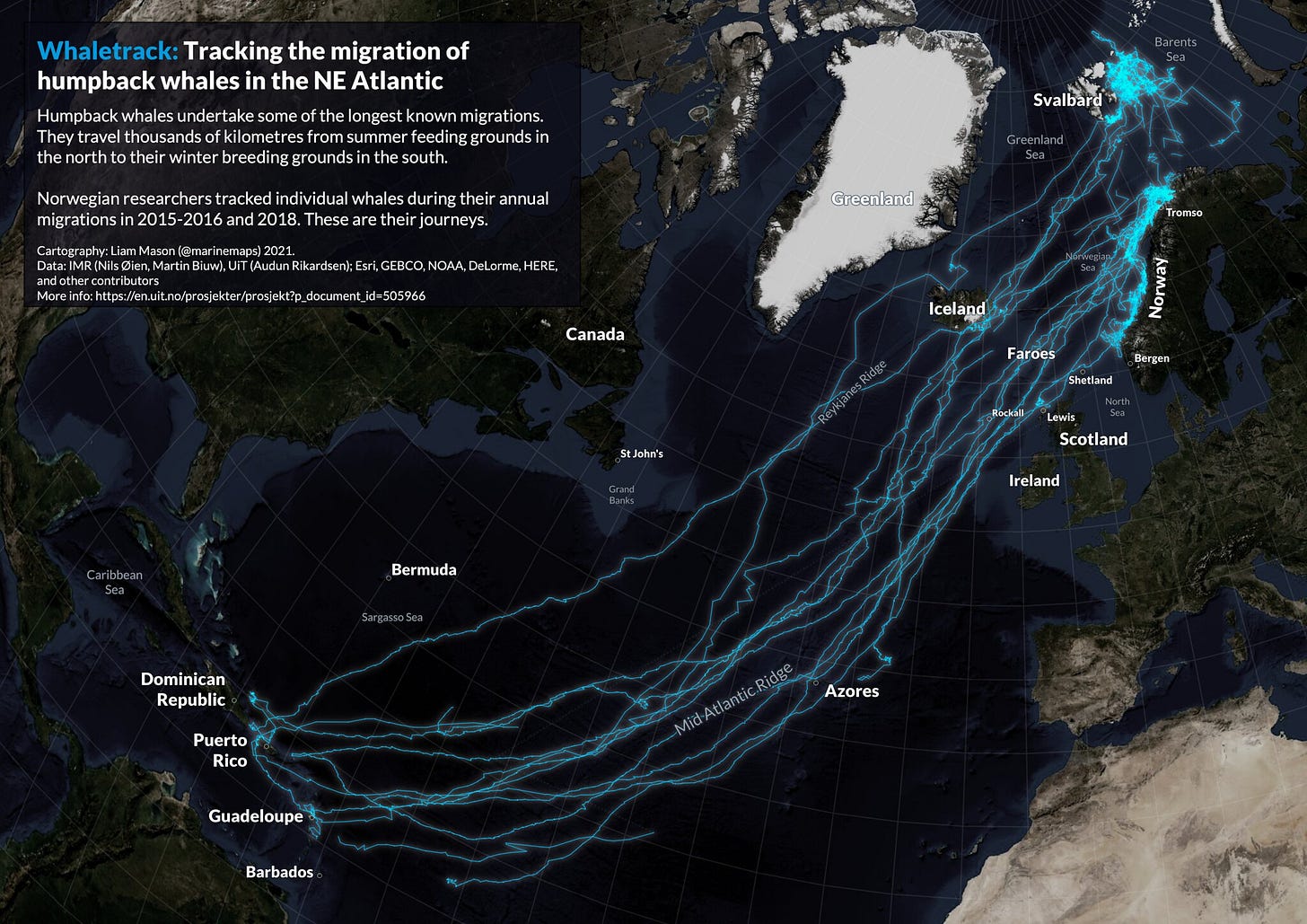
QGIS has a beautiful collection of GIS-based visualisations from their users: GIS Visualisation. What strikes me about such visualisations is their blend of organic textures and artificial elements like printed-style text – a particularly appealing combination.
Cartography by Liam Mason, 2021.
The way a river curves, the contours of mountainous terrain, and the unique shapes of coastal shores – these natural irregularities fascinate me. If there's a specific term for this design style (the mix of organic texture with structured and artificial elements), please do let me know.
I have done a few side projects before, and you can explore more about one of them here. It uses some streaming data from PubNub and visualises these data in real-time - in the lines at the bottom-left corner - each represents weather (temperature, humidity, radiation, etc.)
As I’m picking up my GIS knowledge after several years, it’s already a “new” thing to me. This is partly because skills not regularly practised tend to fade. In addition, things change so fast; software like QGIS keeps upgrading, so there are many things to relearn even for simple projects.
Explaining things is an art
Learning, or in some cases re-learning, a skill isn't a walk in the park. I've been following several YouTube tutorials on GIS – some are exceptional, while others are not. A common thread among the better tutorials is the creator's meticulous preparation, from scripting to data visualisation, making the learning process smoother and more intuitive.
Small details, like well-named variables and helpful comments, can make a significant difference. For instance, a tutorial mentioned adding an OpenStreetMap as a base layer – a simple task, yet it took me extra time to figure out how to do it in QGIS. This experience reminded me of the importance of clarity in my teaching and writing. Being explicit and ensuring each step is well-explained, no matter how trivial it may seem, is crucial.
A good way to learn new stuff
As a beginner, diving into a new field like GIS can be overwhelming. There's a barrage of unfamiliar concepts, terms, and software layouts. It's crucial not to try to absorb everything at once.
The key is to start small, focusing on achievable projects end-to-end. For instance, creating a simple 3D map or examining the population distribution of a specific area. Begin with these manageable tasks, getting comfortable with the basics like keyboard shortcuts and software commands.
After establishing the fundamentals, replicate your projects with slight variations, like exploring a neighbouring area. Each iteration should introduce something new – a different colour scheme, a unique camera angle. This process of gradual refinement builds confidence and competence.
This step-by-step approach, breaking down complex tasks into smaller, manageable segments, is effective. It mirrors how we learn coding – starting with a simple change, applying it in a few contexts with minor tweaks, and then expanding your scope. You can also engage with a community by sharing your progress and outcomes, perhaps on social media, enhancing your learning experience.
This method has been incredibly useful for me, and I plan to continue applying it to more visualisation projects, sharing my insights along the way. I hope this approach helps you in your journey of continuous learning and exploration.


